Website design and rebranding for WCUP

Client

WCUP wcup.eu

Problem

I redesigned the online webshop of WCUP, making it more user-friendly and more professional. I was also asked to rebrand the range into a Performance and an Elite Series, which target two different audiences.

In collaboration with

Digital Leader

Services

  • Branding
  • Art direction
  • Print design
  • Graphic design
  • Brand guidelines
  • Copywriting
  • Site architecture
  • UX design
  • Webshop design
  • UI design
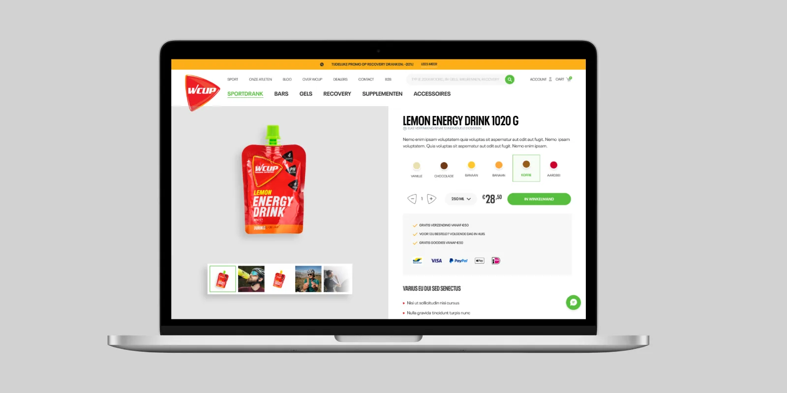
Product page of the WCUP webshop on a laptop, with the Lemon Energy Drink and the order button
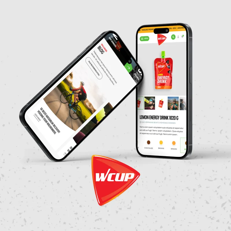
Two smartphones with the WCUP mobile webshop, next to the red WCUP logo
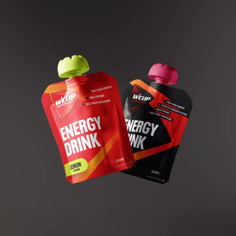
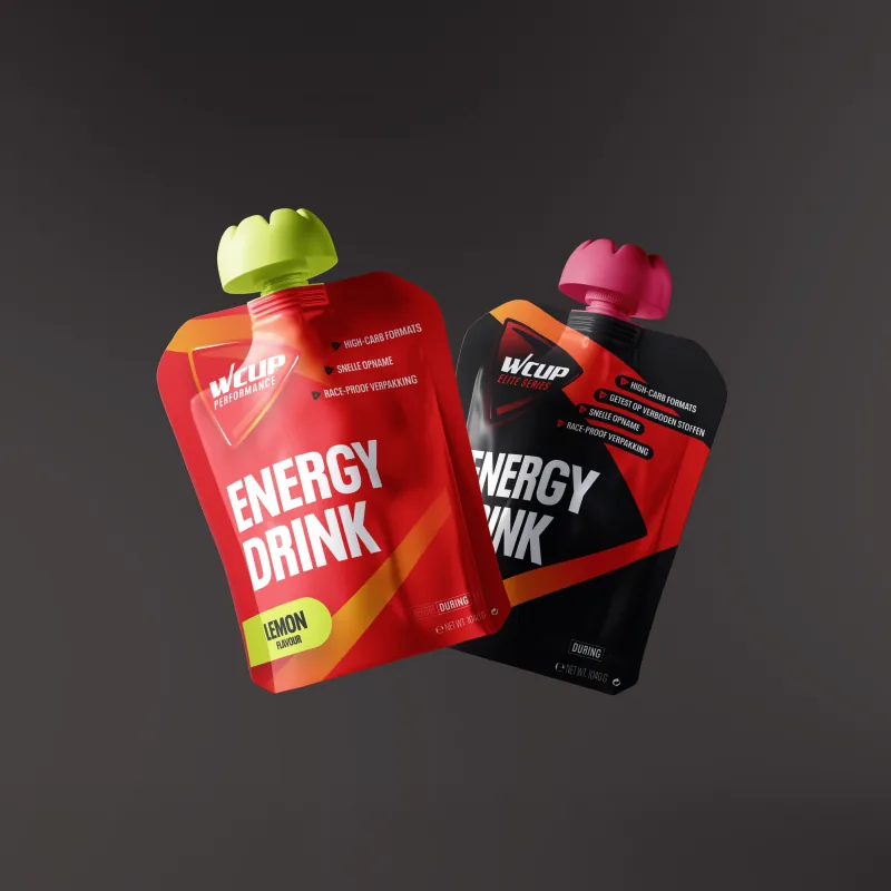
Two WCUP Energy Drink pouches, one red and one black, against a dark background
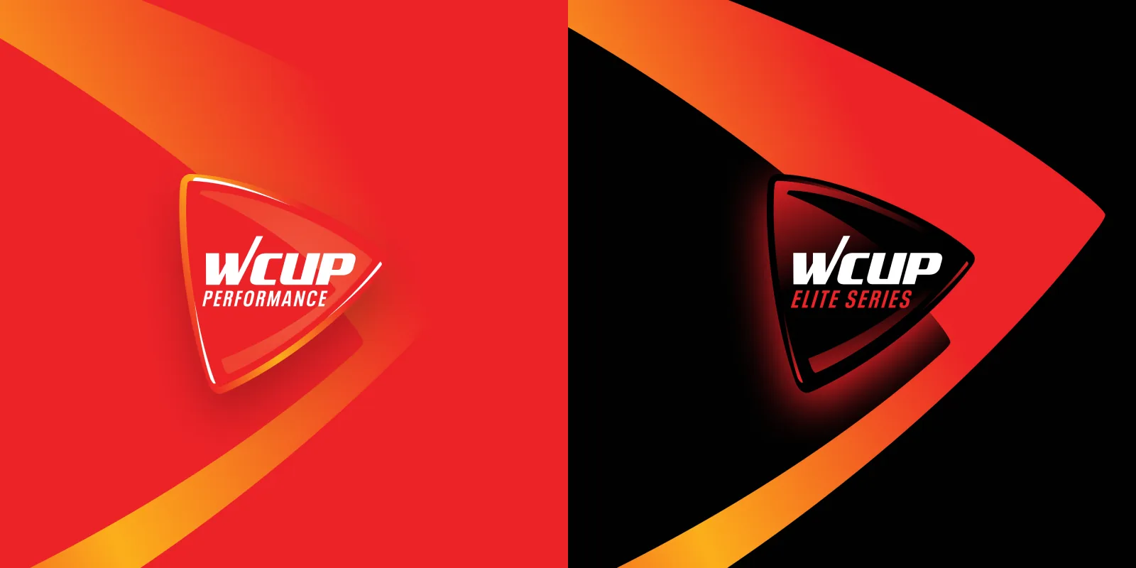
The WCUP logo in two versions: Performance in red and Elite Series in black
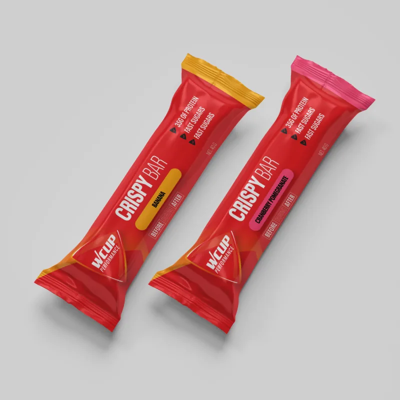
Two red Crispy Bars from the Performance line on a light grey background
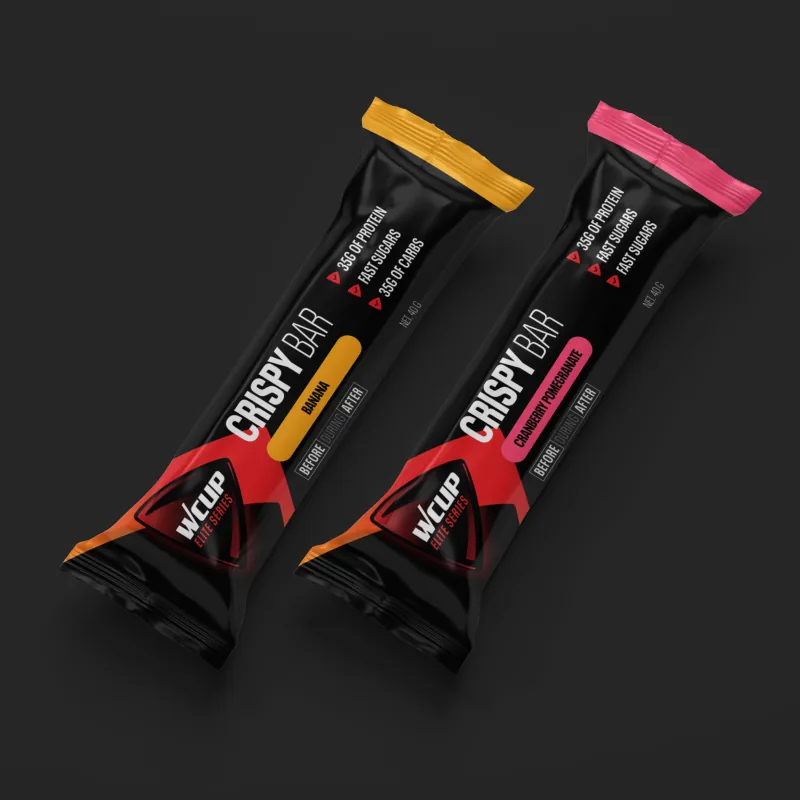
Two black Crispy Bars from the Elite Series on a dark background
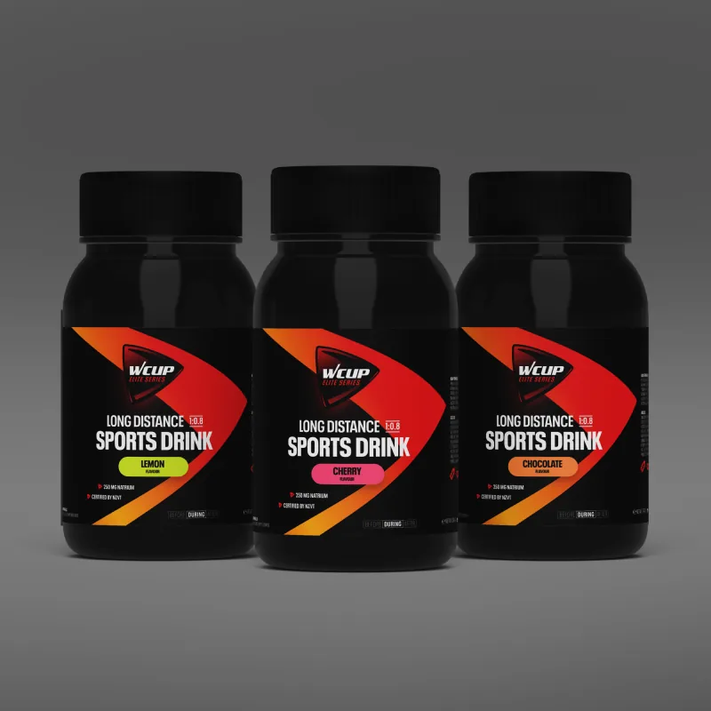
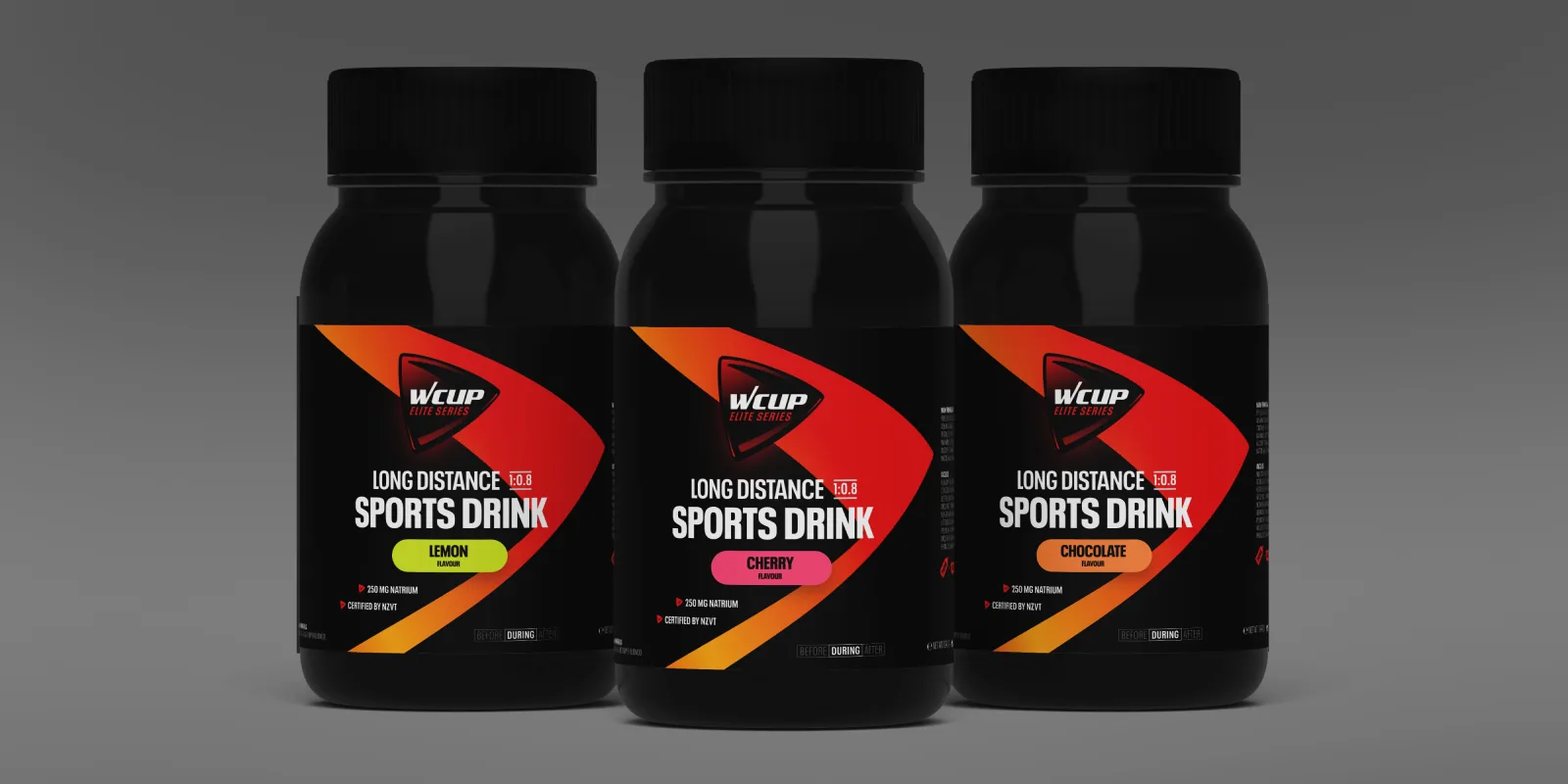
Three tubs of WCUP Long Distance Sports Drink in different flavours
A red and a black WCUP Energy Drink pouch floating against a grey background
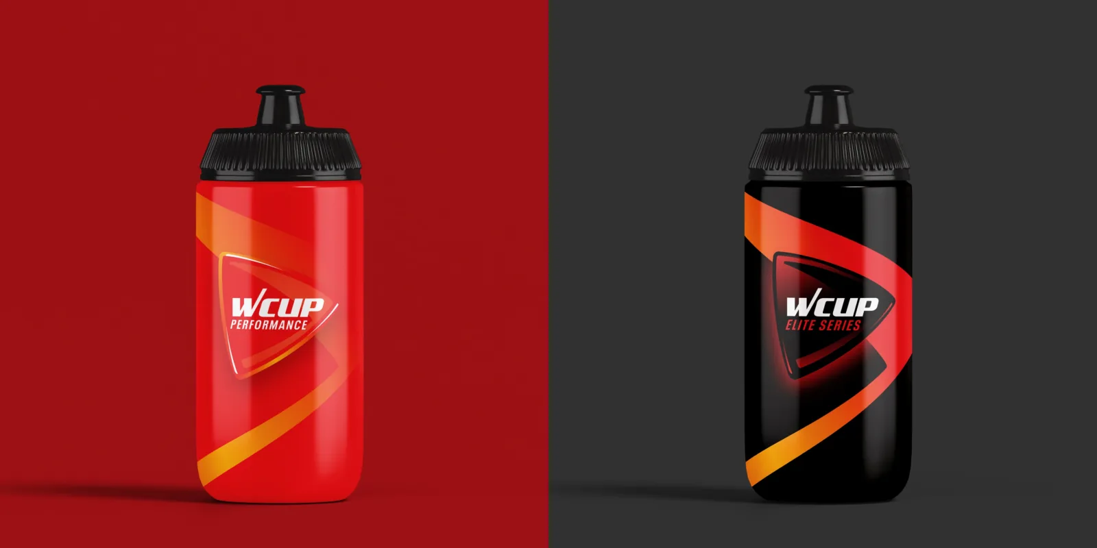
A red Performance water bottle and a black Elite Series water bottle from WCUP
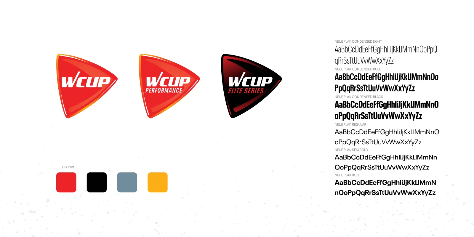
The three WCUP logos (WCUP, Performance and Elite Series), the colour palette and the Neue Plak typefaces
Three black tubs of WCUP Long Distance Sports Drink with a red and orange label
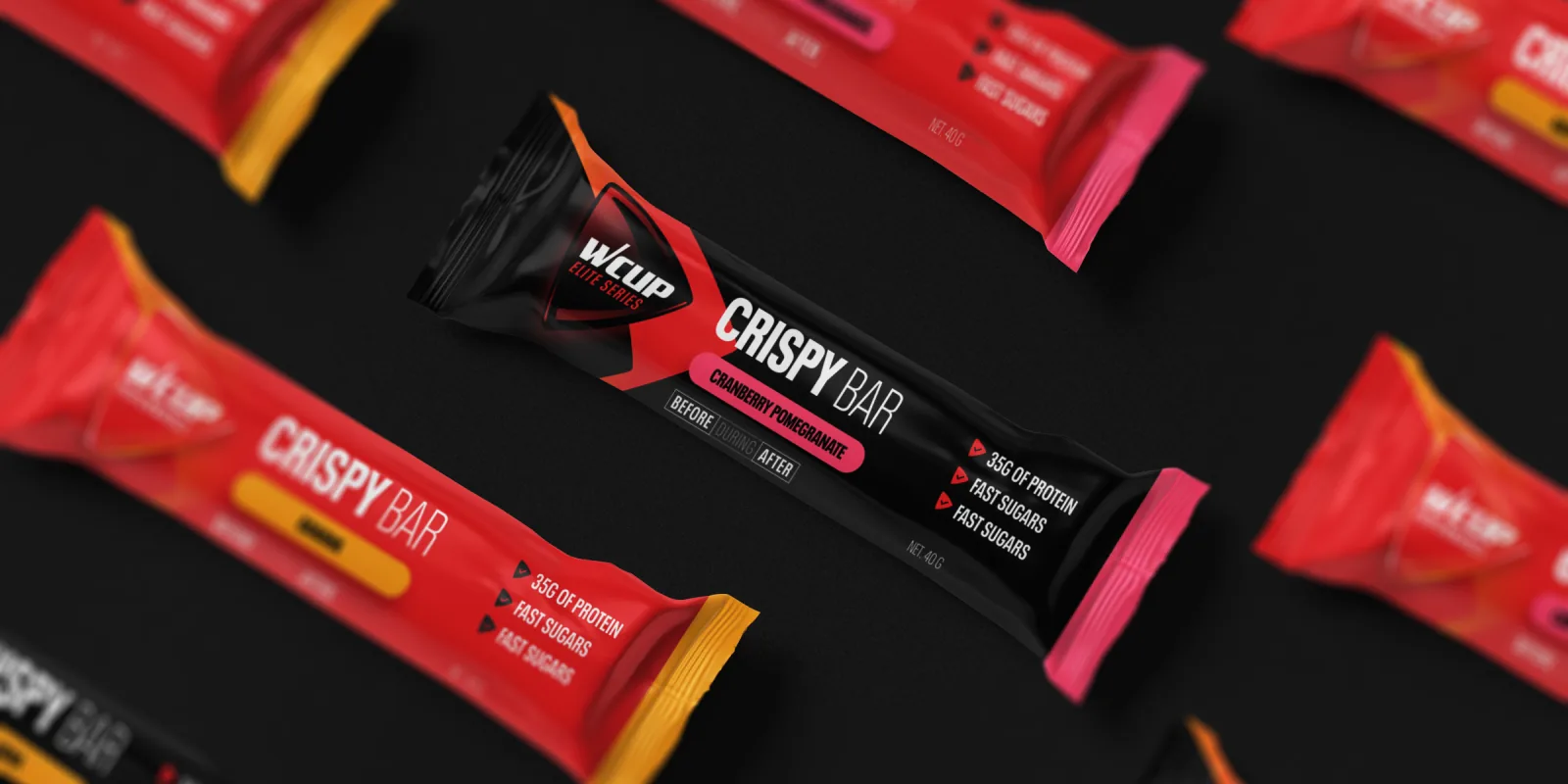
Red and black WCUP Crispy Bars laid out diagonally in a pattern
← Back to the homepage